
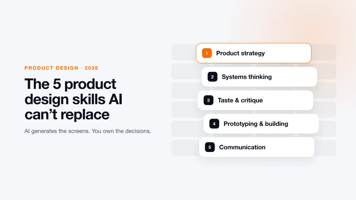
Quick answer: The best techniques for product design today are the ones AI can't do for you: product strategy (deciding what to build and what to cut), systems thinking (design systems AI can read), taste and critique (picking the right option and explaining why), prototyping and building (shipping working prototypes, not static screens), and communication and persuasion (defending decisions in the language of the business). Below is what each one means, what breaks without it, and one exercise you can run this week.
Why product design techniques changed in the AI era
Try this experiment. Open an AI design tool and prompt: "Build me an admin dashboard for a quiz app. I need a list of players, how many correct and incorrect answers they got, and some stats."
A few minutes later you'll get something that looks finished: layout, empty states, responsive breakpoints, the works. Then you actually look at it. The stats are vague and out of place. There's a filter by "topic" and "cohort" you never asked for. Sorting lives in a separate dropdown instead of the table headers. There are "streaks" and "last active" columns that have nothing to do with your idea.
It's polished, and it's wrong. The buttons are generic, there's too much information, and there's no clear workflow for the person who will actually use the screen. AI gave you a beautiful answer to a question nobody was asking.
That's the moment we're in. The work of product design didn't disappear. It moved upstream. If you defined your job as the part AI now does in four minutes, it feels like the floor fell out. If you defined it as the judgment around that part, demand for you is going up.
The hiring data points the same way. Figma's State of the Designer 2026 report found that 56% of hiring managers see rising demand for senior designers, compared with 25% hiring for junior roles. Design isn't dying. The floor is rising.
Here are the five product design techniques that matter most right now.
1. Product strategy: decide what to build (and what not to)
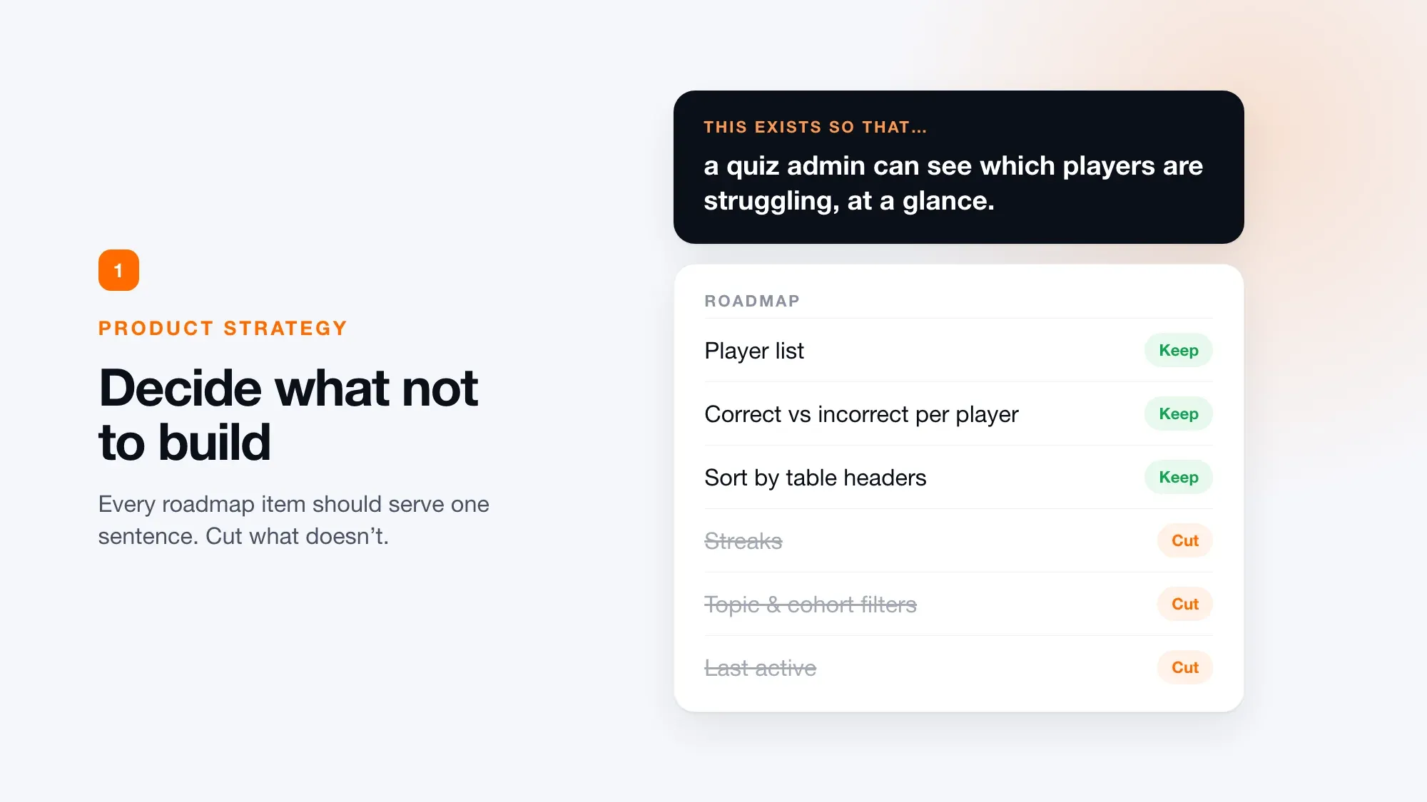
What it is: Product strategy is the argument underneath the roadmap: who the product is for, what outcome it creates, and therefore which features belong and which don't.
How it used to work: Strategy happened before you got the ticket. Someone else did discovery, you received a Jira card, and you designed the screen. You were downstream of every important decision.
What AI does now: Everything downstream. It generates flows, states and screens quickly, and that part is real.
What breaks: When nobody owns the upstream decision, you get a product that's the sum of 20 well-executed features that don't add up to anything coherent. And AI will almost always say yes. Tell it an idea is good and it will agree. It won't tell you to cut.
Nielsen Norman Group's latest State of UX report makes the same point: roles increasingly demand breadth and judgment, not just artifacts, and the designers who thrive treat UX as strategic problem-solving rather than deliverable production. If building is cheap, the bottleneck becomes knowing what to build. UI execution on its own is no longer the differentiator.
In practice, the most valuable strategic call is often subtraction: cutting features, streamlining flows and saying no to things that dilute the core job.
Exercise: the one-sentence test (20 minutes)
- Write one sentence: "This exists so that [a specific person] can [do a specific thing / get a specific outcome]."
- Open the roadmap and find three items that don't serve that sentence.
- Bring those three to your next product meeting.
That's a real strategy contribution, and it's the kind of focus that separates senior designers from junior ones, and human design from AI output.
2. Systems thinking: build design systems AI can read
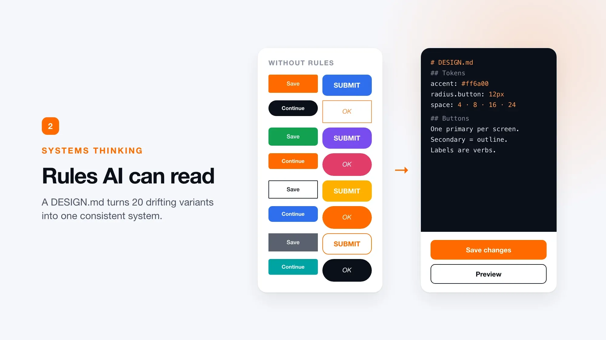
What it is: A design system is no longer a tidy Figma file. It's the instruction set that keeps AI-generated output consistent instead of drifting into slop.
How it used to work: A component library was a nice-to-have. The team cleaned it up on Fridays, and nobody maintained it past month three.
What AI does now: It can produce 20 variations of a button in seconds, and every one looks fine on its own.
What breaks: All 20 ship. The product ends up looking like it was assembled by 20 different people, because it was: different people, different prompts, different agents. Speed without direction leads to divergence.
The shift is that design systems are now written for AI to read as well as humans. They capture a team's decisions, standards and context so taste and craft can scale. Figma's hiring data shows 47% of hiring managers now rate systems thinking and service design as a top-five requirement for new hires.
What a machine-readable design system looks like
A practical format is a DESIGN.md file: a plain-language document that sits alongside your code and describes:
- Tokens: color, spacing, radius, typography and effects
- Visual theme and atmosphere: for example, "bold, high contrast, neon accent on dark backgrounds"
- Color rules: when to use accents, and when not to
- Typography rules and hierarchy
- Component styling: buttons, inputs, modals and overlays, with their states
You can generate a first draft from your Figma variables with a plugin, or from a live staging URL with a DESIGN.md generator, then edit it by hand. Give the same model the same prompt, with and without that file, and you'll see the difference immediately: one version knows your rules and the other doesn't.
For deeper reading, Dan Mall's Design That Scales makes the point that still holds: a design system is a practice you invest in continuously, not an artifact you launch and abandon. Brad Frost is also writing and speaking about agentic, machine-readable design systems.
Exercise: the six-variant audit
- Open your current project and count the variations of one component, such as a button or input.
- If there are more than six, you don't have a system. You have a folder.
- Write one page of plain-English rules a stranger could follow. Use AI to help draft it, but if a new teammate can't read it and apply it, it isn't done.
3. Taste and critique: selection is the job now
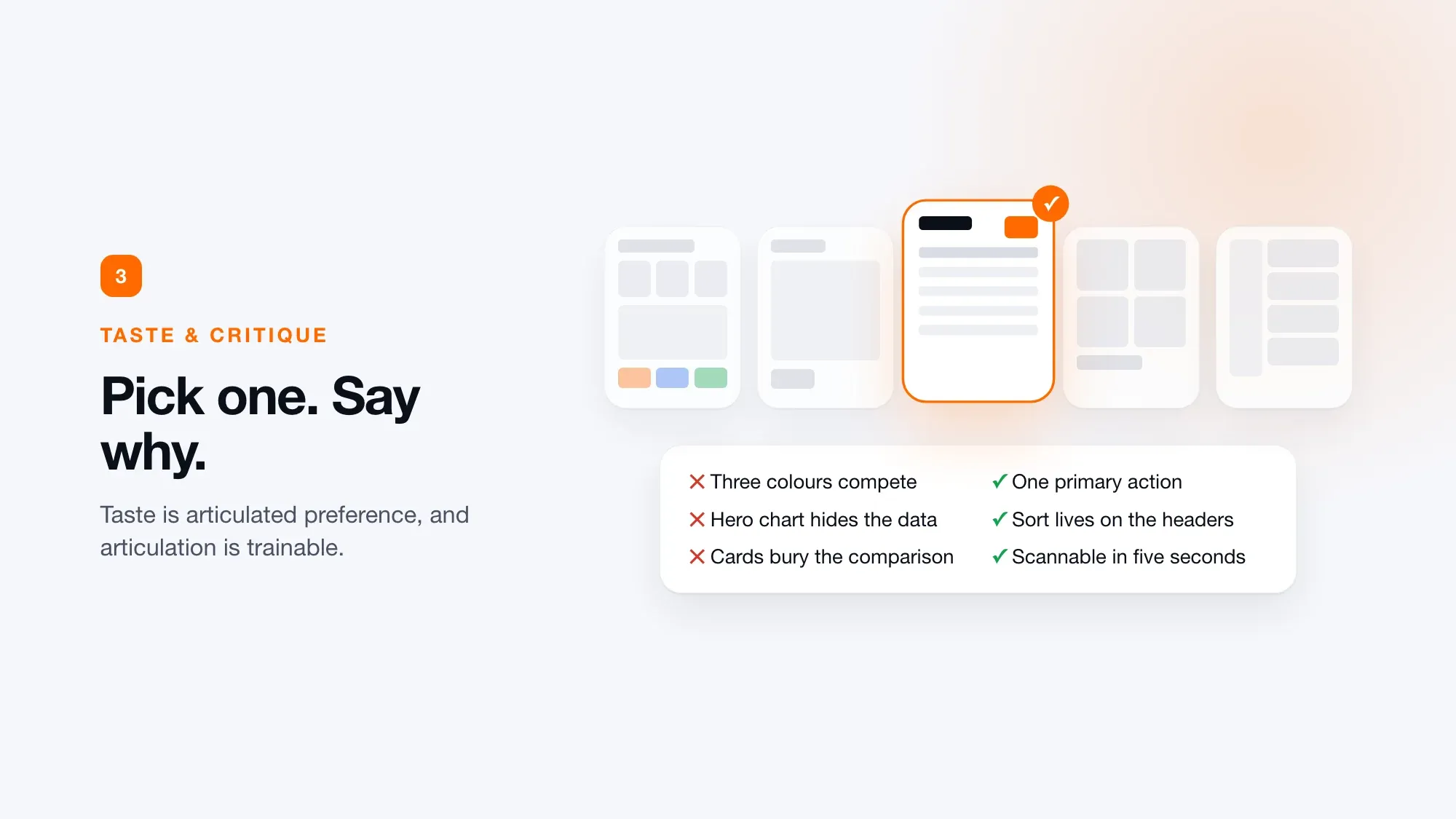
What it is: The ability to judge which option is right, and to explain why in concrete terms.
How it used to work: Taste was treated as unteachable vibes. Everyone mentioned it in portfolio reviews and nobody defined it.
What AI does now: It gives you ten options in ten seconds.
What breaks: That sounds like a gift, but it creates a new bottleneck: your judgment. Most designers have never trained it deliberately.
Linear, a product known for its craft, frames the AI shift this way: the bottleneck moves upstream to judgment, taste and the quality of the idea itself. AI can generate an interface, but it can't decide what feels right to a human.
Julie Zhuo makes the same case from the product side: when execution gets fast, strong principles become the competitive advantage. The best work feels inevitable, as if the interface couldn't have been any other way.
Recruiters are already noticing the opposite. Case studies narrate the same idealized double diamond, layouts repeat, and AI-assisted portfolios start to signal sameness instead of capability. Companies don't want average generalists.
Exercise: five screens, 150 words
- Generate five versions of the same screen.
- Pick one.
- Write 150 words on why the other four are wrong and this one is right. Not "I like it better." Use real reasons: hierarchy, the decision it pushes the user toward, and what it costs.
Repeat this often and you'll build a vocabulary. Taste isn't magic. It's articulated preference, and articulation is trainable.
4. Prototyping and building: if it doesn't move, you can't defend it
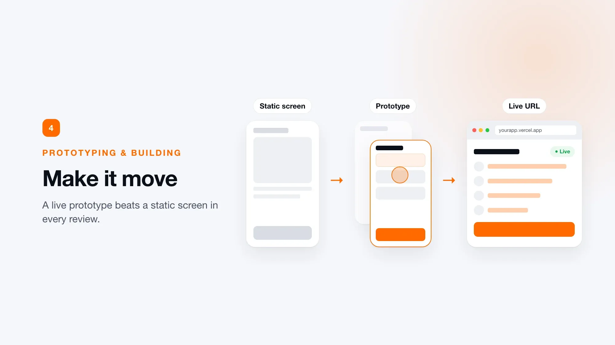
What it is: Turning designs into working, interactive prototypes, and increasingly into real, deployed software.
How it used to work: A Figma click-through built for one usability test and thrown away afterwards.
What AI does now: This is where AI is clearly on your side. Prompt-to-prototype is standard, and some teams have dropped static mockups entirely, with prototypes becoming the central design output.
What breaks: Two things. If you can't build, you lose the argument to whoever can show the thing working. And if you can only prompt but can't evaluate what comes back, you're just shipping bad work faster.
Hiring has already priced this in. According to Figma's report, 73% of hiring managers expect AI tool fluency, and over half of designers and hiring managers consider skills like prompting to a quick prototype or vibe-coding an app essential.
Listing tools in your skills section isn't enough. Show prototypes you built in Cursor, Claude Code or similar, and explain how they got you closer to owning the front end. A clickable prototype is the difference between telling someone how something works and showing them.
A realistic workflow
- Design key screens in Figma to set the visual direction.
- Prototype the flow with an AI prototyping tool to check that progression and interactions feel right.
- Build it for real with an AI coding tool: a GitHub repo, a backend such as Supabase, and a deployment on Vercel with a live URL.
Even as your own stakeholder, a working version you can click through tells you far more than static screens. For design directors and product leads deciding what ships, it's the difference between an opinion and evidence.
Exercise: one screen, live
Take your last static case study and rebuild one screen as something usable. Try a tool you haven't used yet, such as Replit, Claude Code or Codex. Deploy it with live data and a public URL, and put it in your portfolio. That's far more convincing than "look at my Figma file."
5. Communication and persuasion: a decision you can't defend is just a preference
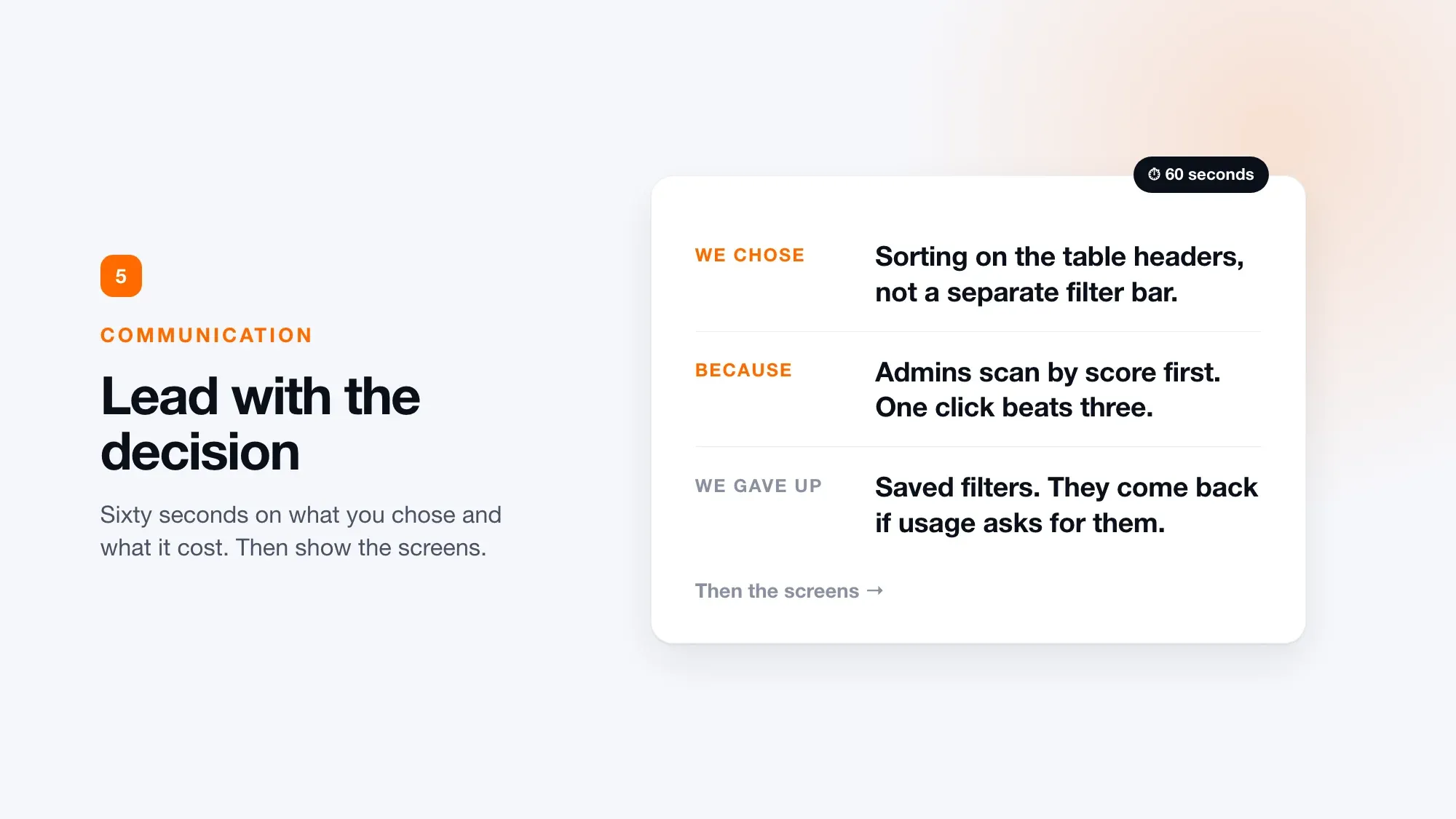
What it is: Framing design decisions in the language the business speaks, and holding the line when it matters.
How it used to work: Filed under soft skills, listed last on job posts and taught by nobody.
What AI does now: Almost nothing, and that's the point. AI can draft your document, but it can't read the room. It doesn't know the VP killed a similar idea last quarter, and it can't push back in a meeting when someone senior challenges you.
What breaks: The most common failure in design isn't bad work. It's good work that never ships because nobody explained why it mattered.
When mechanical work compresses, value moves to problem framing: knowing which of the ten AI options is right, why, and having the political skill to get it shipped. This matters more as teams get smaller and roles absorb work that used to be spread across several specialists. There's nobody left to hand the argument to.
Exercise: decision first, tour second
Next time you present, don't open with a walkthrough. Open with: "We chose this because of that, and here's what we gave up." Spend 60 seconds on the decision, then show the screens.
The five product design techniques at a glance
| Technique | What AI does | What you own | This week's exercise |
|---|---|---|---|
| Product strategy | Generates features and screens | What to build and what to cut | One-sentence test, cut 3 roadmap items |
| Systems thinking | Generates endless variants | Rules that keep output consistent | Audit variants, write a one-page DESIGN.md |
| Taste and critique | Generates 10 options in 10 seconds | Choosing, and explaining why | 5 screens, 150 words of critique |
| Prototyping and building | Speeds up prototypes and code | Evaluating and shipping what works | Rebuild one screen as a live prototype |
| Communication and persuasion | Drafts documents | Reading the room, getting work shipped | Lead with the decision, then the screens |
The real shift: the skills aren't new, the timeline is shorter
None of these techniques is new. Each was always the senior half of the job. What changed is the runway. Designers used to get roughly five years of pushing pixels to grow into strategy, systems, judgment and persuasion. That runway is gone.
The skills didn't get harder. The timeline got shorter. If you want more senior roles, better pay and a seat at the table, pick one of these five and run the exercise this week.
Frequently asked questions
What are the best techniques for product design?
The five most valuable product design techniques today are product strategy, systems thinking, taste and critique, prototyping and building, and communication and persuasion. AI can handle much of the visual execution, so these judgment-heavy skills are now what set strong product designers apart.
Will AI replace product designers?
AI is replacing parts of execution, such as generating screens, states and component variants, but not the decisions around them. Demand is shifting toward senior designers who can decide what to build, set system rules, judge output and get work shipped. Figma's 2026 data shows rising demand for senior designers.
What is the most important product design skill?
Product strategy: deciding what to build and, just as importantly, what not to build. When building is cheap, knowing what's worth building becomes the bottleneck.
How do you improve design taste?
Treat taste as articulated preference. Generate several versions of a screen, choose one, and write a short critique explaining why the others fail, using concrete reasons like hierarchy, user decisions and trade-offs. Repeating this builds the vocabulary that taste depends on.
What is a DESIGN.md file?
A DESIGN.md is a plain-language file describing a product's design system: tokens, visual theme, color and typography rules, and component styling. It's written so both people and AI tools can follow it, which keeps AI-generated UI consistent with your brand.
Do product designers need to code now?
Not necessarily at a production level, but they increasingly need to build working prototypes. Most hiring managers now expect AI tool fluency, and a live, clickable prototype is far more persuasive than static screens in reviews and portfolios.
Spotted something outdated or wrong?
Report an issue
We hate ads too. Sign up free to remove them







Comments